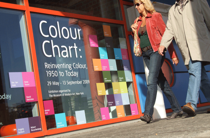
We were commissioned to handle the launch campaign for Tate Liverpool’s summer blockbuster exhibition called: Colour Chart.
Colour Chart took it’s inspiration from a group of artists who use household paints straight
out of the can. Artists like Gerhard Richter, Damien Hirst and Ellsworth Kelly.
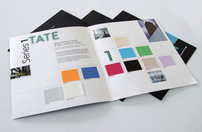
When this project landed we nearly wet ourselves for two reasons, firstly because it’s a real ‘designer’ job, plenty of grids and flat colour and secondly because we knew what we had
deep in our files…About 10 years ago Tate launched their own range of paints in B&Q –
we’d kept the colour charts even when the paint was discontinued. Our idea was to use these
paints as the central element to the campaign – ink was mixed to match the swatches from
the various colour charts to create a launch poster.
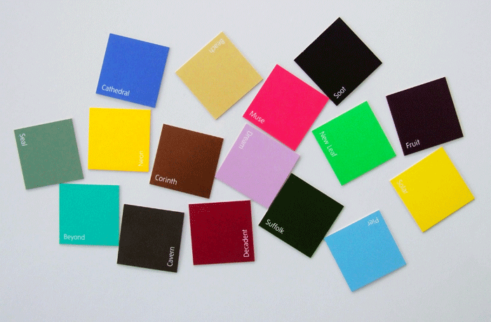

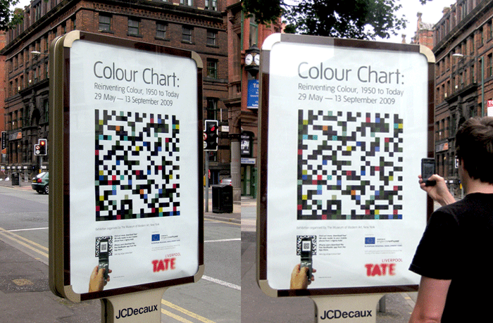
This poster not only delivers the ambience of the exhibition – using paints from the Tate’s
very own paint range – these swatches also combine to create a smartcode which delivers
video content about the artists and the wider exhibition in a contemporary way.